The Maximizing the Yield of Small Samples in Prevention Research: A Review of General Strategies and Best Practices paper by Hopkin, Hoyle, and Gottfredson (2015) suggests that when working with small sample sizes, analysts should leverage plots to explore within-group associations between predictor variables and the outcome variable. These plots are intended to provide detailed insights about the data rather than to be used for generalizing to the population.
The paper cites the work of Carrig, Wirth, and Curran (2004) who proposed an easy-to-use SAS macro for visualizing person-specific growth trajectories with repeated measures data.
The objective of the OLStrajr package is to bring the functionality of this SAS macro, OLStraj, to R. While the original link to the macro in Carrig’s paper is no longer active, it can still be accessed through the Wayback Machine.
You can install the released version of OLStrajr from CRAN with:
install.packages("OLStrajr")You can install the development version of OLStrajr as follows:
# install.packages("devtools")
devtools::install_github("mightymetrika/OLStrajr")This serves as an exemplary demonstration of using OLStrajr. It features an analysis of data representing the yearly ratio of male to female robins, as documented in Birds: incomplete counts—five-minute bird counts Version 1.0. This data, collected at Walker Creek and Knobs Flat from August 2005 to August 2009, provides a compelling case study
# Load package
library(OLStrajr)
# Get robins data
data(robins)
# Print robins data
robins
#> site aug_05 aug_06 aug_07 aug_08 aug_09
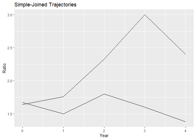
#> 1 Walker_Creek 1.67 1.50 1.80 1.6 1.38
#> 2 Knobs_Flat 1.64 1.76 2.33 3.0 2.40To obtain the OLS trajectories, use the following code:
robins_traj <- OLStraj(data = robins,
                      idvarname = "site",
                      predvarname = "Year",
                      outvarname = "Ratio",
                      varlist = c("aug_05", "aug_06", "aug_07",
                                  "aug_08", "aug_09"),
                      timepts = c(0, 1, 2, 3, 4),
                      regtype = "lin",
                      int_bins = 3,
                      lin_bins = 3)
The OLStraj function provides several types of plots that facilitate the examination of your data:
robins_traj$group_plots
#> $simple_joined
#>
#> $ols
#> `geom_smooth()` using formula = 'y ~ x'
Group plots depict the simple-joined trajectories and the estimated trajectories for each group in your data, allowing for a quick comparison of trends across different groups.
robins_traj$individual_plots
#> $`ols Knobs_Flat`
#> `geom_smooth()` using formula = 'y ~ x'
#>
#> $`ols Walker_Creek`
#> `geom_smooth()` using formula = 'y ~ x'
Individual plots represent each subject’s unique trajectory over time, providing insights into individual patterns of change.
robins_traj$histogram_plots
#> $intercepts
#>
#> $slopes
These histograms reveal the distribution of intercepts and slopes across subjects. They are useful for identifying skewness or other interesting distributional properties in the data.
robins_traj$box_plot
Box plots provide a summary of the distribution of intercepts and slopes across subjects. They allow you to visualize the spread and skewness of the data. Any outliers are clearly highlighted in these plots. In the OLStraj box plots, the mean value is represented by a blue dot. Additionally, each outlier is labeled with the corresponding subject identifier, providing a straightforward way to identify subjects whose data deviate significantly from the rest of the group.